
TAIGA
Taiga, named after the world’s second-largest forest, represents not only size and scale but also the enduring strength that comes with it.
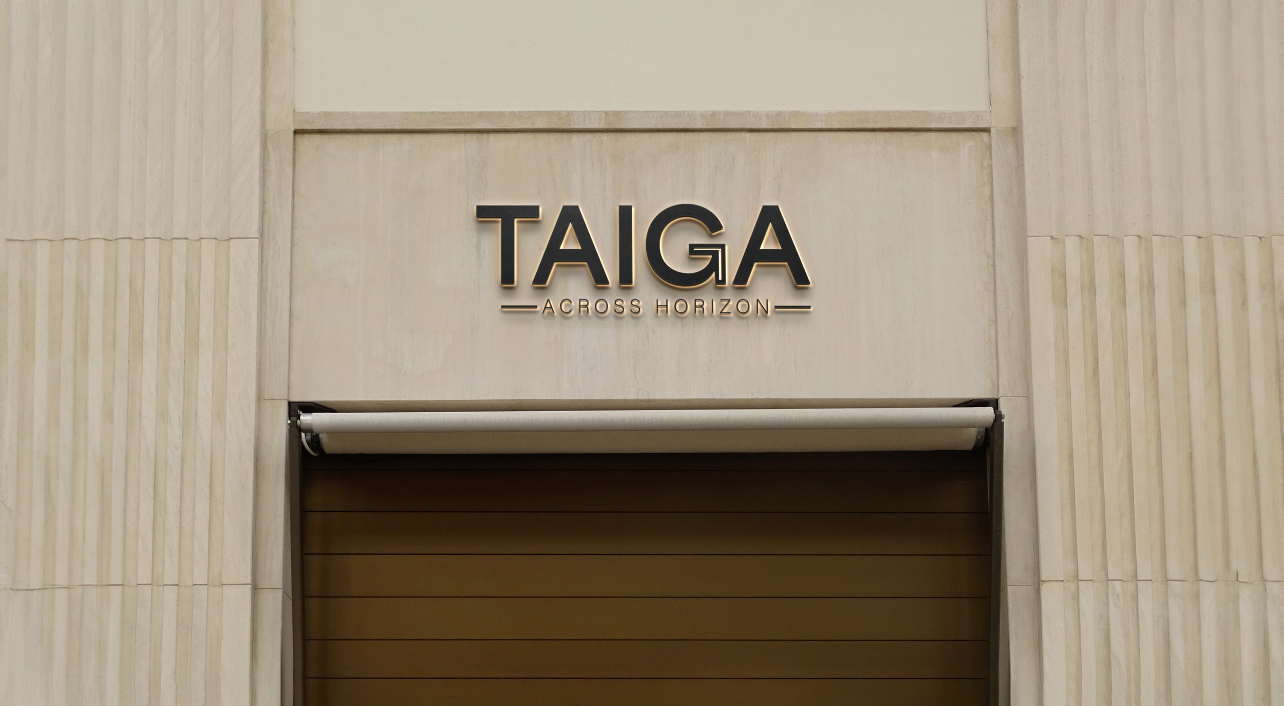
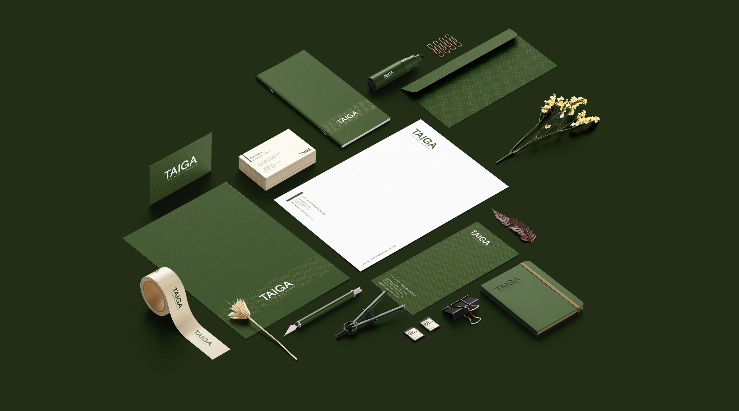
Designing the brand identity for Taiga was an exciting challenge. Our client wanted a logo that captured strength, prosperity, and growth—and we delivered.
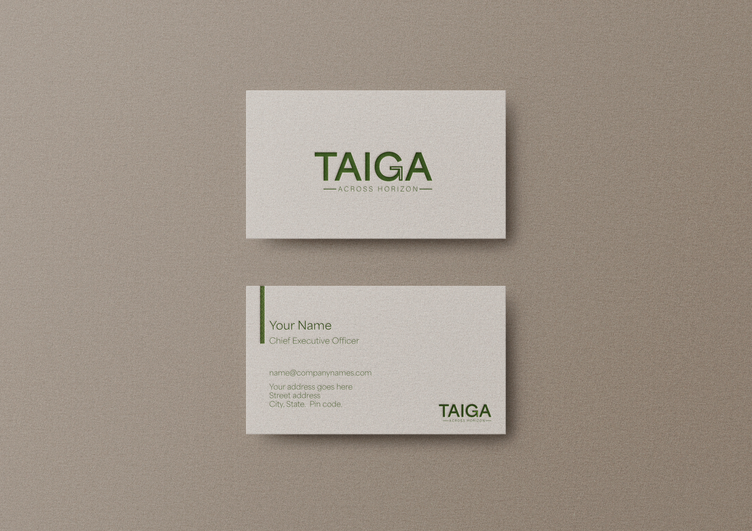
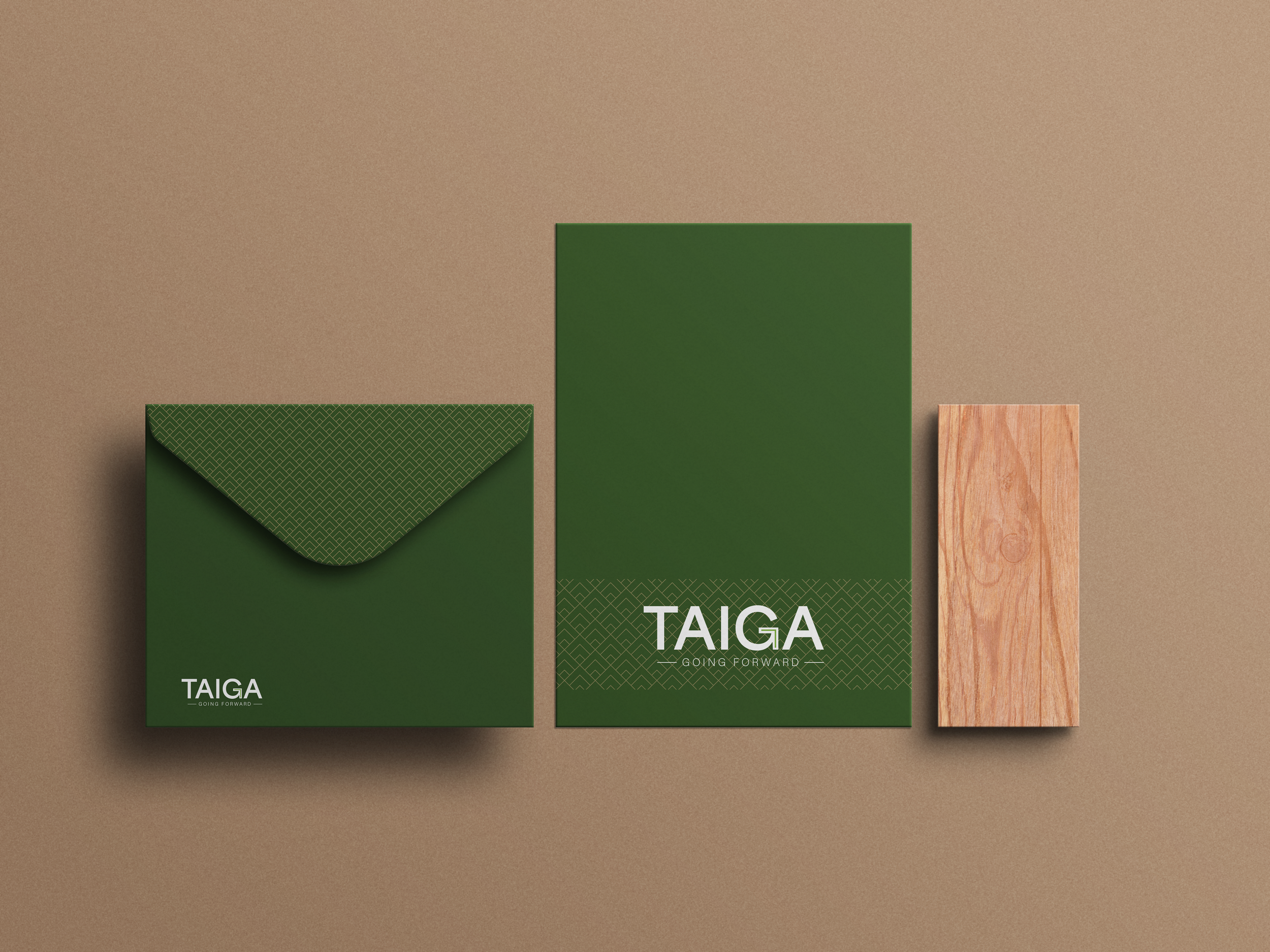
We combined elements of power and growth to encapsulate their brand’s essence. From the specific shade of green to subtle details like the hidden arrow, every element is intentional, making this project truly stand out.